This is the second part of the series Technical Analysis - Candlestick Charts.
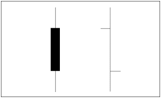
Standard bar charts are commonly used to convey price activity into an easily readable chart. Usually four elements make up a bar chart, the Open, High, Low, and Close for the trading session/time period. A price bar can represent any time frame the user wishes, from 1 minute to 1 month. The total vertical length/height of the bar represents the entire trading range for the period. The top of the bar represents the highest price of the period, and the bottom of the bar represents the lowest price of the period. The Open is represented by a small dash to the left of the bar, and the Close for the session is a small dash to the right of the bar.
Bar Compared to Candlestick Charts
Below is an example of the same price data conveyed in a standard bar chart and a candlestick chart. Notice how the candlestick chart appears 3-dimensional, as price data almost jumps out at you.
The long, dark, filled-in real bodies represent a weak (bearish) close , while a long open, light-colored real body represents a strong (bullish) close . It is important to note that Japanese candlestick analysts traditionally view the open and closing prices as the most critical of the day. At a glance, notice how much easier it is with candlesticks to determine if the closing price was higher or lower than the opening price.
Common Candlestick Terminology
The following is a list of some individual candlestick terms. It is important to realize that many formations occur within the context of prior candlesticks. What follows is merely a definition of terms, not formations.We have already discussed about black candle and white candle, just above.
Spinning Tops -- candlesticks with small real bodies, and when appearing within a sideways choppy market, they represent equilibrium between the bulls and the bears. They can be either white or black.
Doji Lines -- have no real body, but instead have a horizontal line. This represents when the Open and Close are the same or very close. The length of the shadow can vary.
In the next part, candlestick reversal patterns will be discussed.


